Hungry Helpers
July 2023 - August 2023
Hungry Helpers is an online business that strives to teach kids how to cook. The primary target of Hungry Helpers are parents who want their kids to learn cooking, but other age demographics can learn to cook with this website too.
Yes, I'm aware this has the same name as the CS Project. However, I see it as a potential expansion for it because it explores a lot more features for it and I can make it look nicer now that I have experience with UX Design.


Problem:
Most kids lack cooking skills and that lack of culinary knowledge will make them struggle to make their own food in the future as they live their own lives.
Goal:
Design an app that teaches kids how to cook healthy food and prepare them with culinary skills that help them manage a balanced diet.
My Role:
UX designer designing an app and screen size variants for Hungry Helpers from conception to delivery.
Responsibilities:
Conducting interviews, paper and digital wireframing, low and high-fidelity prototyping, conducting usability studies, accounting for accessibility, iterating on designs, determining information architecture, and responsive design.
User Research: Summary
In my user research, I conducted empathy maps and interviews to understand the potential users for Hungry Helpers. After my research, I discovered that a lot of the users who hope to use the product are parents who want their kids to learn how to cook. This was the primary user group and they confirmed my assumptions them. However, I was also surprised that young adults were interested because they mentioned that cooking is an essential skill as they grow up. One of their main problems were finding simple and healthy recipes to cook. Other problems included having the money to purchase ingredients to make the food.
Persona: Noelle

Noelle is a busy real estate agent and single mom who needs a useful method that teaches her kids how to cook because she’s too busy with her job to teach them herself.
Persona: Mark
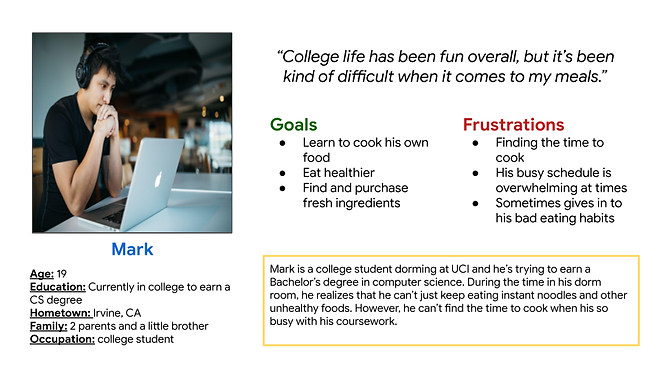
Mark is a college student who needs a simple and easy way to cook healthy food because he wants to eat healthy and have the time to finish his coursework.
Competitive Audit
An audit of a few competitor’s products provided some guidance on how to address roadblocks and opportunities when working on the Hungry Helpers project.
Ideation
I did a quick ideation exercise to come up with ideas on how to the gaps that were identified in my competitive audit. I wanted to focus on making simple recipe features and highlighting important information regarding recipes.

Digital Wireframes
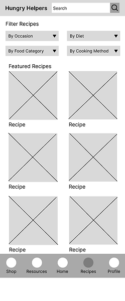
After ideating and drafting some paper wireframes, I created the initial designs for the Hungry Helpers app. The designs focused on helping users find recipes.
Added filters to help users narrow down the recipes they want to look at.
Navigation bar is always at the bottom to help users navigate the app’s features.


Included search bar to help users easily find recipes they want.
Added checkboxes to help users keep track of what ingredients they have.
Low-Fidelity Prototype
To prepare for usability testing, I created a low-fidelity prototype that connected the user flow of finding a recipe and checking off ingredients needed to complete the recipe.

Usability Study: Parameters
-
Study Type: Moderated Usability Study
-
Location: United States | Remote
-
Participants: 5 participants
-
Length: 10 - 15 minutes
Usability Study: Findings
-
Recipe Filter: Users found it really helpful that there were filters for finding recipes as it helps them narrow down what they’re looking for, but they said it could be worded differently.
-
Recipe Information: While the users did like the current information on the recipes, some users needed more info on them to determine if they were worth making.
-
Visual Guidance: Some users wanted more visual guidance to help them make the recipe instead of just words.

Mockups
Before Usability Study
After Usability Study

I decided to change the filter named “By Occasion” to “By Meal” because the word “occasion” seemed broad. Using “meal” was more appropriate because it refers to breakfast, lunch, and dinner. This was my original intention.
Before Usability Study
After Usability Study
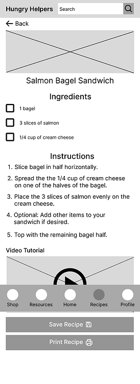

I added more features on the recipe screen such as a rating system and other recipes related to the one the user is currently looking at.
Final Mockups


High-Fidelity Prototypes
The mobile high-fidelity prototype presented cleaner user flows. I made it easier to for the user to understand the recipe finding process.

Sitemap
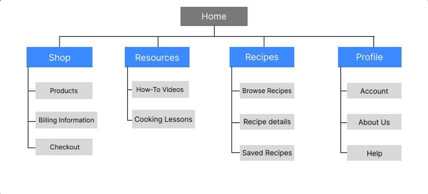
With the app designs completed, I started to work on designing the responsive website with a sitemap. The sitemap will guide the organization of each screen’s design and ensure a consistent experience across devices.
Responsive Designs
These are the screen size variations of the Hungry Helpers website on mobile, tablet, and desktop. I had to optimize the designs to fit each design and screen size.
Mobile Version

Tablet Version
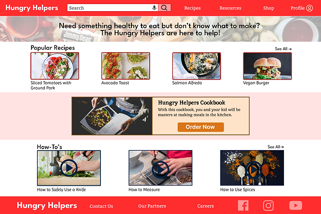
Desktop Version

Accessibility Considerations:
-
Voice: I added a microphone icon in the search bar so users have the option say what they want to search instead of typing.
-
Iconography: I included checkboxes in the ingredients section to help users remember what ingredient they do and don’t have.
-
Images: I showed preview images of the recipes to let users know what food they are going to make.
What I Learned:
I learned that optimizing and changing the design to fit different screen sizes is important. I had to adjust parts of my design for each screen and it was a bit challenging trying to figure out how to accommodate for user needs, but coming up with solutions for them was useful.
